Highlight on mouseover for optgroups (not trying to make them selectable)

For a collapsible optgroup implementation (really basic one here: https://codepen.io/elsewhere_/pen/wVrxvG), I want to have the selection cursor actually highlight the optgroups to better show which group the mouse is over currently and show they can be clicked more clearly. The behavior when clicking the optgroups doesn’t have to change whatsoever (I don’t want them to actually be selectable, in other words, I know the current implementation doesn’t allow that anyway).

Is there a style setting that can accomplish this? My gut reaction is no, as I see that the last non-optgroup element that was moused over stays highlighted so I would also need to find a way to re-style that to not be highlighted when specifically mousing over optgroups. However, if there is some variable or event I could take advantage of to re-style everything properly then it may just be doable. I’m open to suggestions!

Does this do what you want?

li.select2-results__option[role=group]:hover {
  background-color: #fc8;
}

It’s definitely a step in the right direction! It differs from the exact behavior I’m looking for though - basically I’m trying to make the optgroup header highlight as if it’s a clickable group, since in the collapsible dropdown implementation clicking it does do something. So in other words it should highlight and appear as if it is the sole selectable option.

There seem to be a few hurdles to getting that behavior currently:

  • The “role=group” css you suggested seems to apply to the entire optgroup which is not desired (just the header should get this mouseover css ideally). I’m not familiar enough with roles to know if there is some way to disambiguate here.
  • I’m not sure how to change the css of the currently highlighted “real” selection when an optgroup is moused over (I want to make it look not highlighted, since when the mouse is over an optgroup clicking does not select it, it expands/collapses the optgroup). Perhaps I can tie an event to mouseover of the optgroup, but again I’m hitting the hurdle of knowing how exactly to only address the optgroup header, not the whole group.

OK, If I understand you correctly, you want the optgroup heading to highlight when the optgroup is hovered while closed, but after clicking on the heading to open it, you don’t want the heading to highlight (until it is closed again).
:
Assuming that’s what you want, check out this fork of your pen: https://codepen.io/John30013/pen/Xvxdee?editors=0110

The solution is to add a class to the heading when the optgroup is open, and use that class to control whether the heading should highlight on hover. See the CSS I added, and the updates I made to your onclick handler.

If that’s not what you want, then can you give me an exact, step-by-step description of the behavior you want—in terms of the state of the optgroup and what is being hovered over? In other words, what should happen in each of the following states:

  • Optgroup is closed, and mouse hovers over the optgroup heading.
  • Optgroup is open, and mouse hovers over the optgroup heading.
  • Optgroup is open, and mouse hovers over a child item.

Sorry for the delay in responding, thanks for the help again. I’ve now taken a look at your code.

This kind of css classing you used to achieve the effect you did is exactly the piece of knowledge I don’t have a good view into. Where might I find a description of all these select2 pseudo-elements like “li.select2-results__option[role=group] > strong:not(.group–open)”? Well, actually that seems like conditioning based on several attributes that I’d like to be aware of. Some of that css structure is foreign to me as well but knowing the attributes is probably a good starting point anyway.

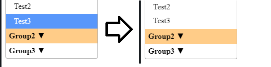
In any case, let me try to clarify exactly where this deviates from the behavior I was looking for. Again as a general statement, the idea is to get the optgroup looking more or less like a selectable element as far as mouseover is concerned, but not changing its behavior whatsoever. This is just to make it look more clearly like the optgroup can be expanded/collapsed visually. So:

  • Optgroup highlights whenever moused over (trivially your example can be modified to remove the “not(.group–open)” so no problem satisfying this point.)
  • Actual selection de-highlights when an optgroup is being moused over (appears as though it is not selected. This is so that it looks like the optgroup is the sole selection). To be precise here, the final behavior would be:
    • When an optgroup is moused-over,
    • The current selection’s font color becomes the default (black) and its background color becomes the default (white) so that it appears unselected.

That second bullet is where the trouble lies for me, as I don’t know what attributes I have at my disposal in css to try to achieve that effect. Any insight into that would be useful.

Edit: I decided to attach an image of the proposed re-styling, too. This shows my intention that when the optgroup is moused over, the active selection appears de-selected so that it is clear what clicking will do for the user (expand/collapse the optgroup, not make a selection).

restyle_on_hover

You wrote:

The internal structure of the Select2 widget isn’t officially documented anywhere. I’ve learned it by using the browser’s Dev Tools Element Inspector. Note that the group-open class comes from my code–it’s not something that Select2 applies.

Thanks for the more detailed explanation of what you’re trying to do. Unfortunately, I’m not sure a pure CSS solution is possible, because the currently selected item can be anywhere in relation to the optgroup being hovered over (i.e., a preceding or following sibling, a child, or a sibling’s child). You will probably need to use JavaScript (in the form of a hover event handler) to programmatically change the visual styling of both the currently selected item and the optgroup heading. It is possible to attach your own event handlers to the internal DOM elements that Select2 creates, although my experience is that you must open the dropdown at least once to cause Select2 to create those DOM elements. (Once created, they are reused, so you can safely attach your event handler to the DOM elements after the initial opening of the dropdown—assuming the DOM element(s) you attach to do not change as the user searches. I would suggest attaching the event handler to a parent element—such as the ul—and take advantage of event bubbling so a single event handler can handle hovers over any descendant element of the ul [via the event’s target property]).

Frankly, I think what you’re trying to do is not consistent with the behavior of a native HTML select control. In particular, with a native select control with optgroups, hovering over the group heading does not make it appear to be selectable, nor does it make the currently selected item appear to be unselected. I think you should carefully consider the supposed benefits of your proposed UI behavior vs. the work it will take to accomplish it. For instance, do you have any evidence (user studies, etc.) that this UI behavior will actually improve the user’s understanding of how this component works, or is this primarily meant to be decorative?

You could be right about my intended solution being a misuse of sorts. And yes, this change is largely cosmetic in nature and more of a nice-to-have.

At any rate I will investigate attaching handlers to the DOM elements as you have suggested and see if I can achieve what I’m looking for from there. I’ll reply back with my findings, if there are any to be had anyway!

Thanks for your help.